KAleidoscope
Kaleidoscope is a non binary take on the Art Nouveau style. Taking concepts from both stereotypically ‘feminine’ and ‘masculine’ fonts, the typeface sits between the two. Organic shapes and thick curves meet the digital world, suggesting how the future of type could look
in a world without gender stereotypes. The typeface showcases the evolution of gendered type throughout history by blending the ideas of
a modern concept with a historical style.
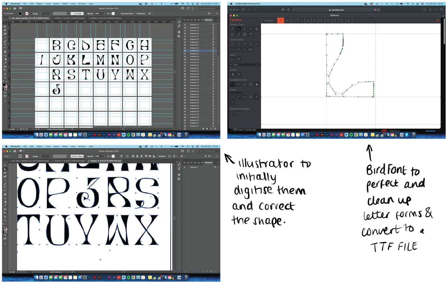
Kaleidoscope is a display typeface which was designed as a solution to gendered language. It’s high contrast and beautifully balanced organic to geometric shape ratio allows it to thrive in large point sizes in both printed and digital formats, making it the perfect typeface
to make a statement.


This project was inspired by the influence of gender stereotypes in design. So much of what we consume, even typefaces, is gendered. Bold, geometric typefaces are often described
as masculine while organic, light typefaces are labeled feminine. These associations are reinforced from an early age through the marketing of toys targeted specifically at boys
or girls.
Before starting this project, I knew that toys marketed towards girls, such as Barbie, would feature organic, flowing, curvy typography in pink or purple packaging. Similarly, I expected boys’ toys to use sharp, geometric typefaces in colours like blue or red. After conducting primary research at a popular children’s toy shop, my assumptions were confirmed and revealed even more shocking divides. The store was clearly split into two sections, one for girls and the other for boys. The “girls” section was plastered floor to ceiling in pink glitter, with toys such as babies and hair styling tools dominating the shelves. Meanwhile, the “boys” section, completely lacking decoration, displayed toys like cars, tools and action figures, in blue, green and red. The blatant contrast felt outdated, and I was surprised that such concepts still existed in this day.


This experience motivated me to design a gender non-binary typeface that challenges these stereotypes. The typeface, Kaleidoscope, is named after the popular gender neutral children’s toy that offers a spectrum of colours and perspectives - a concept that mirrors the goal of my project. Kaleidoscope blends geometric and organic elements, balancing strength and delicacy to create a typeface that defies traditional gender associations. It’s bold yet playful, designed to make a statement and set a new standard for inclusivity in the packaging industry. By encouraging designers to adopt this typeface, I hope to contribute to breaking down gender stereotypes and fostering a more equitable approach to design.