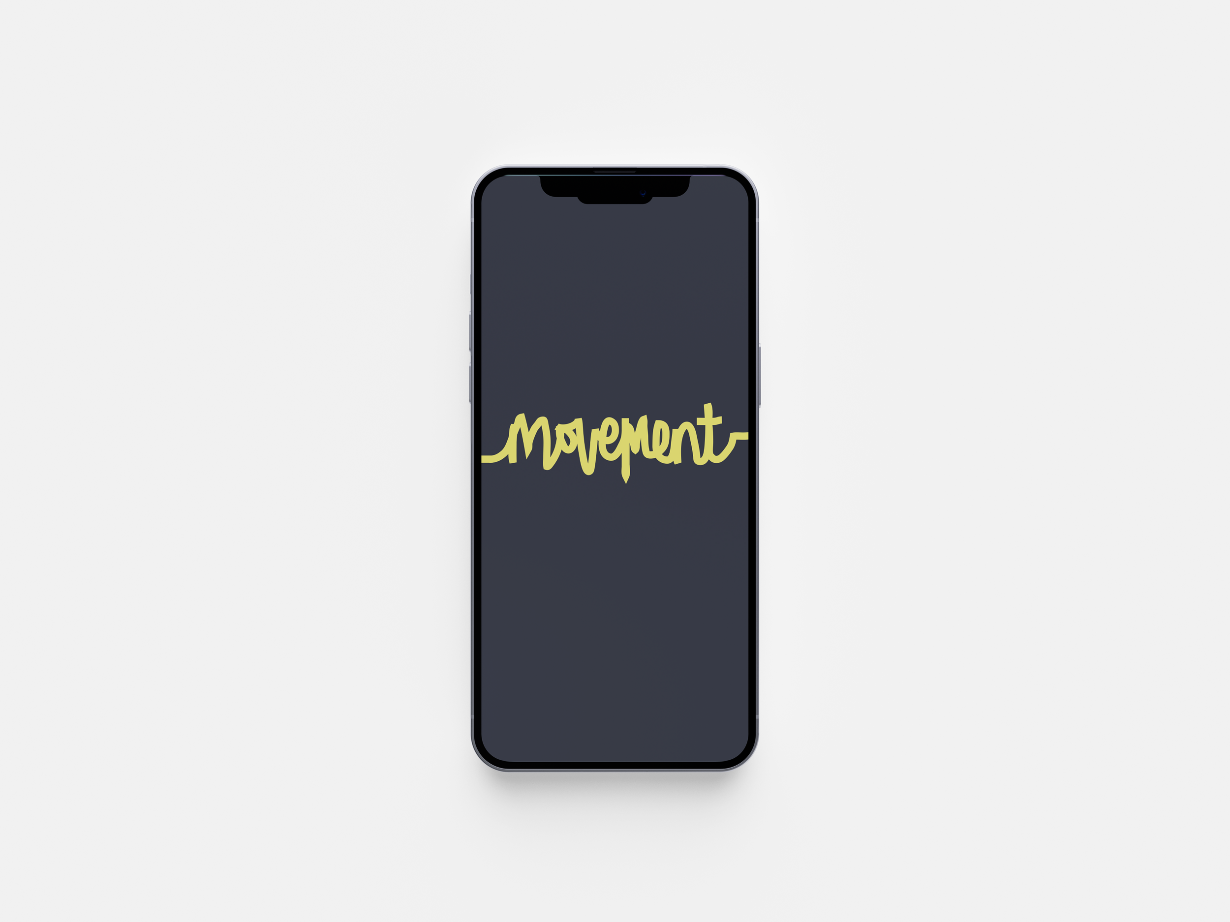
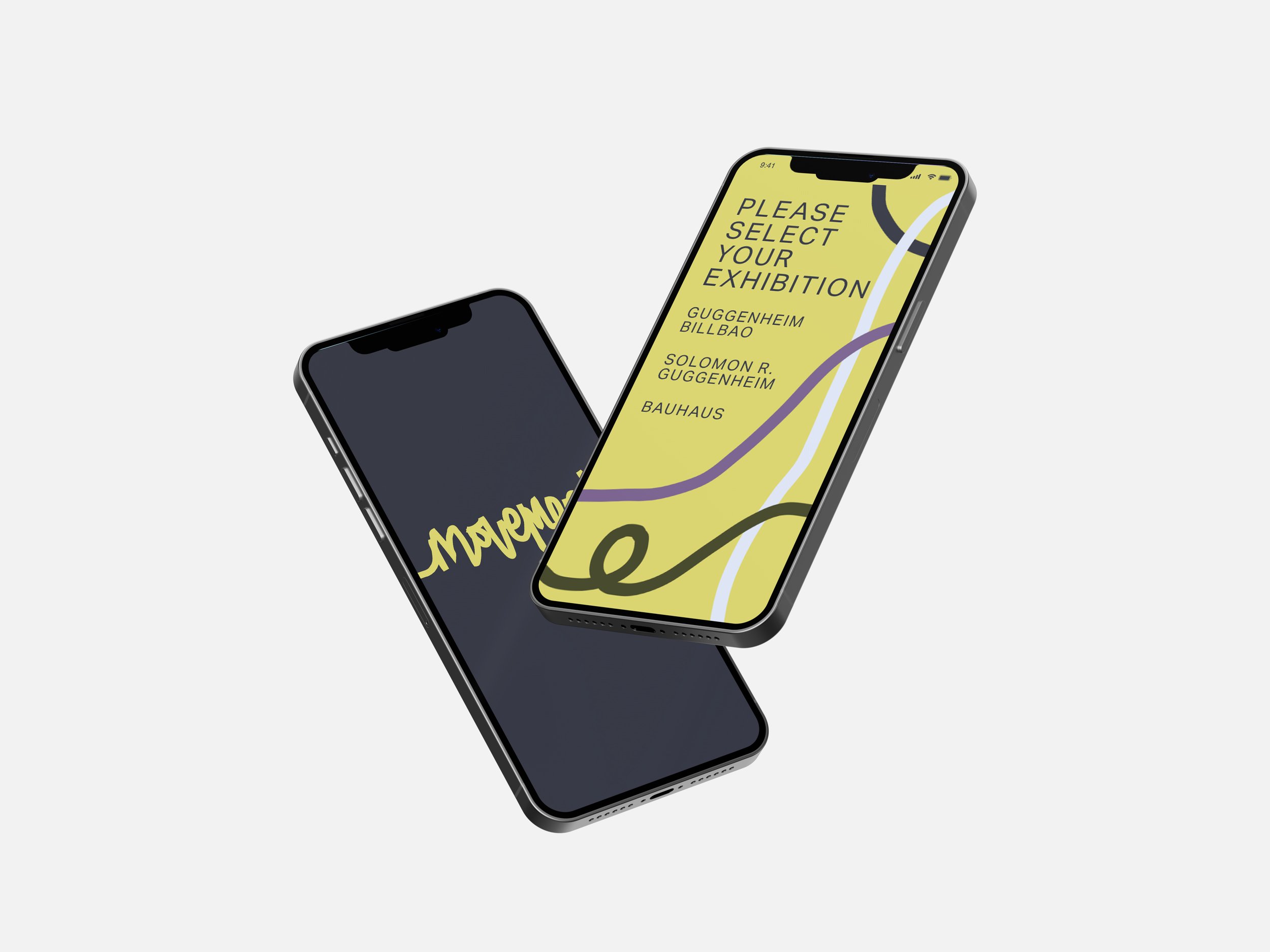
Movement
This UX Design project was inspired by the difficulties people often face when visiting museums or gallery spaces. Often, it can be overwhelming to try to process large amounts of information in such a short span of time, particularly if you are neurodiverse or have a visual impairment.
Movement is a mobile application which provides a solution to the inaccessibility of many art galleries and museums. Using augmented reality and way-finding, it will create easy navigational systems, leading you from one exhibit to another while providing you with digestible pieces of information. The navigational systems can be customised to fit your taste and needs, therefore suits a range of different audiences and age ranges.
This project was inspired by my experience with visiting museums and art galleries, as I have always found them to be overwhelming, and full of decisions such as “Where do I start, and where do I finish?”, “What do i skim read, and what do I read fully?” and “Am I keeping up with the pace of the people I am here with?”. Alongside this, I found it tiring to try to ingest such large volumes of information in such a short period of time. Before long, I stopped putting pressure on myself to enjoy this experience.
My time in education is another element that inspired this project. When I was at school, there was very much one way of learning, and not much room to question if that was the best way for me to learn. Starting university introduced me to so many different ways of learning and taking in information. This support helped me to understand myself, and the cognitive struggles I sometimes faced. Movement allows everybody to access this support by providing a stress free and straight forward way to visit museums.
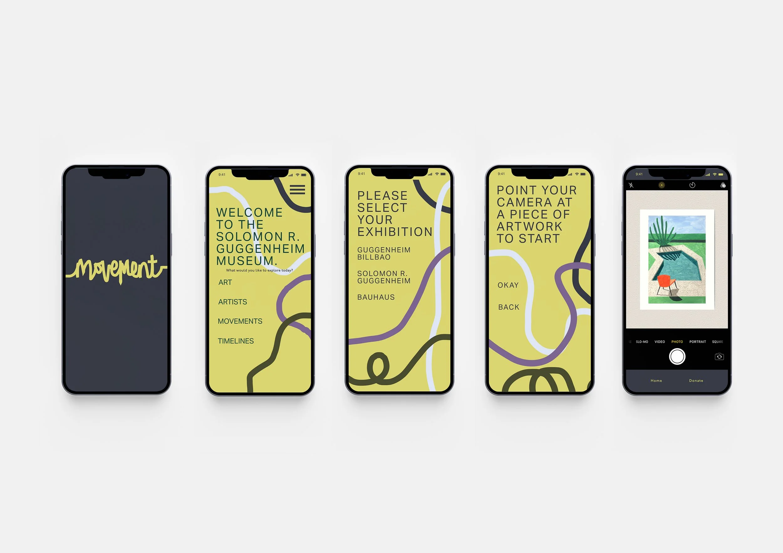
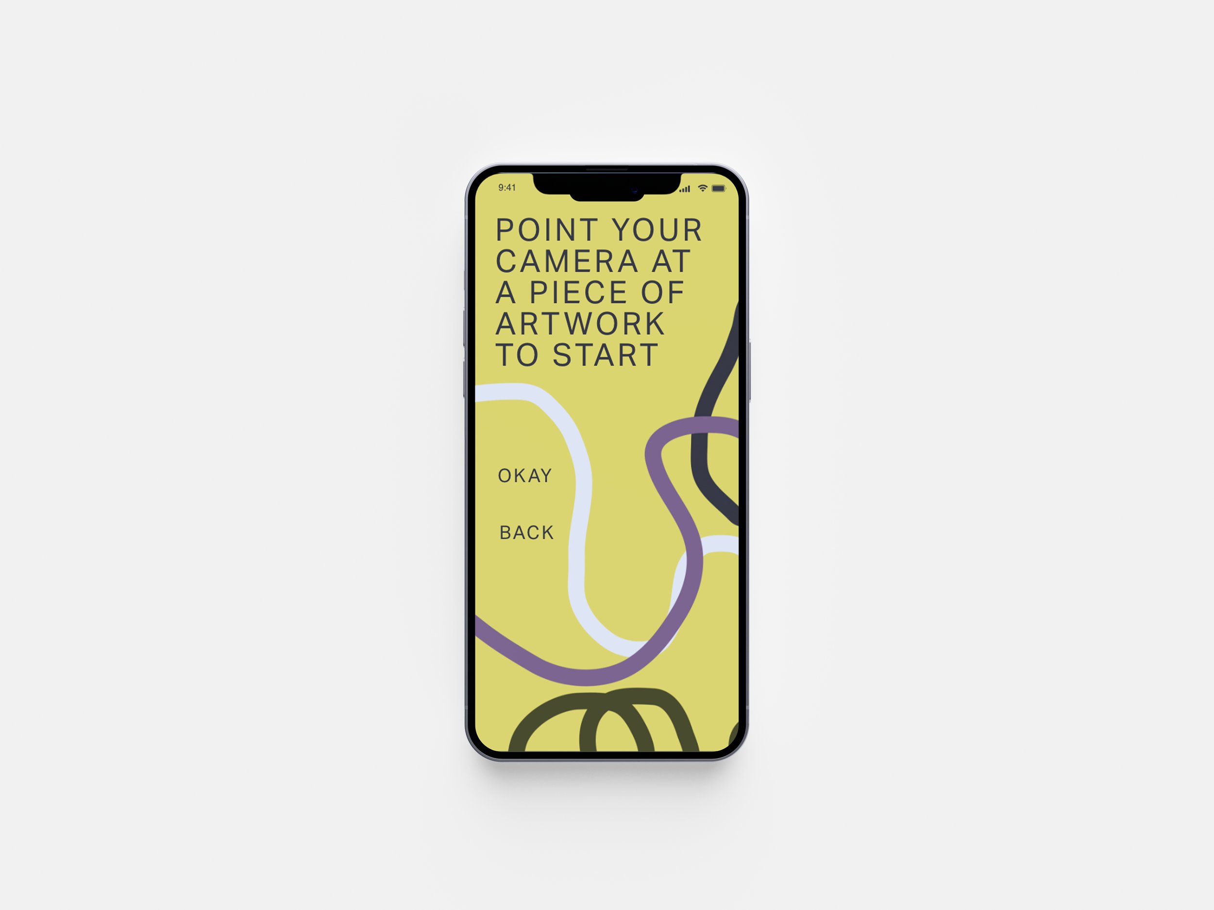
As you start the app, you’ll select what you’d like to explore. For example, if you were to select ‘Timelines’, a map would be generated for you, with a route for you to take. It will start you at a piece of art, perhaps this would be the oldest piece of art in the museum. From there, augmented reality creates sound and movement to grab your attention as it brings the piece of art to life. Information is spoken to you via headphones in small, digestible sections, making it easier to retain. The information you hear, as well as the routes that are generated for you can be saved in the app, eliminating pressure to remember everything you learn.
The goal of Movement isn’t to allow or pressure you to remember and store every piece of information available to you at a museum, but instead, to create an enjoyable experience where you feel inspired and you can take away what you like from it, without pressure.
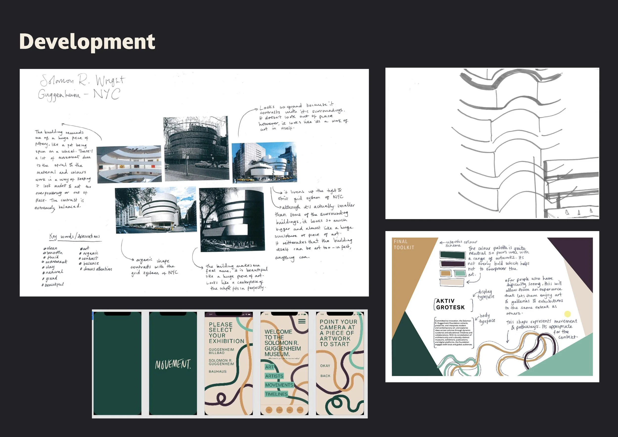
The visual identity of movement was inspired by the organic forms of the Solomon R Guggenheim museum. The museum brings a sense of peace which contrasts with the tight grid systems of buildings that surround it. I imagine that when walking through the busy streets of New York, you’re met with the feeling that you can take a deep breath again when seeing the Guggenheim, which is the effect I would like movement to give.
The typeface decision was of course very important. I chose Aktiv Grotesk for it’s sturdiness and clarity. Both of these characteristics were elevated by editing the kerning, expanding it to give a sense of space and quietness. The snaking shapes, which are a constant across the whole app, help to communicate direction and movement, highlighting to meaning of this project. The colour scheme was important to get right, as the audience range is so broad, but I think that it fits well with the needs of the project. The yellow is bright but tasteful and softly contrasts with the dark grey colour to enable both comfort and engagement.